About
The task was to develop brand identity for Cyclo which is an e-bike riding service that users can rent for an affordable, easy ride around town, with the goal of making a better and sustainable society.
Solution
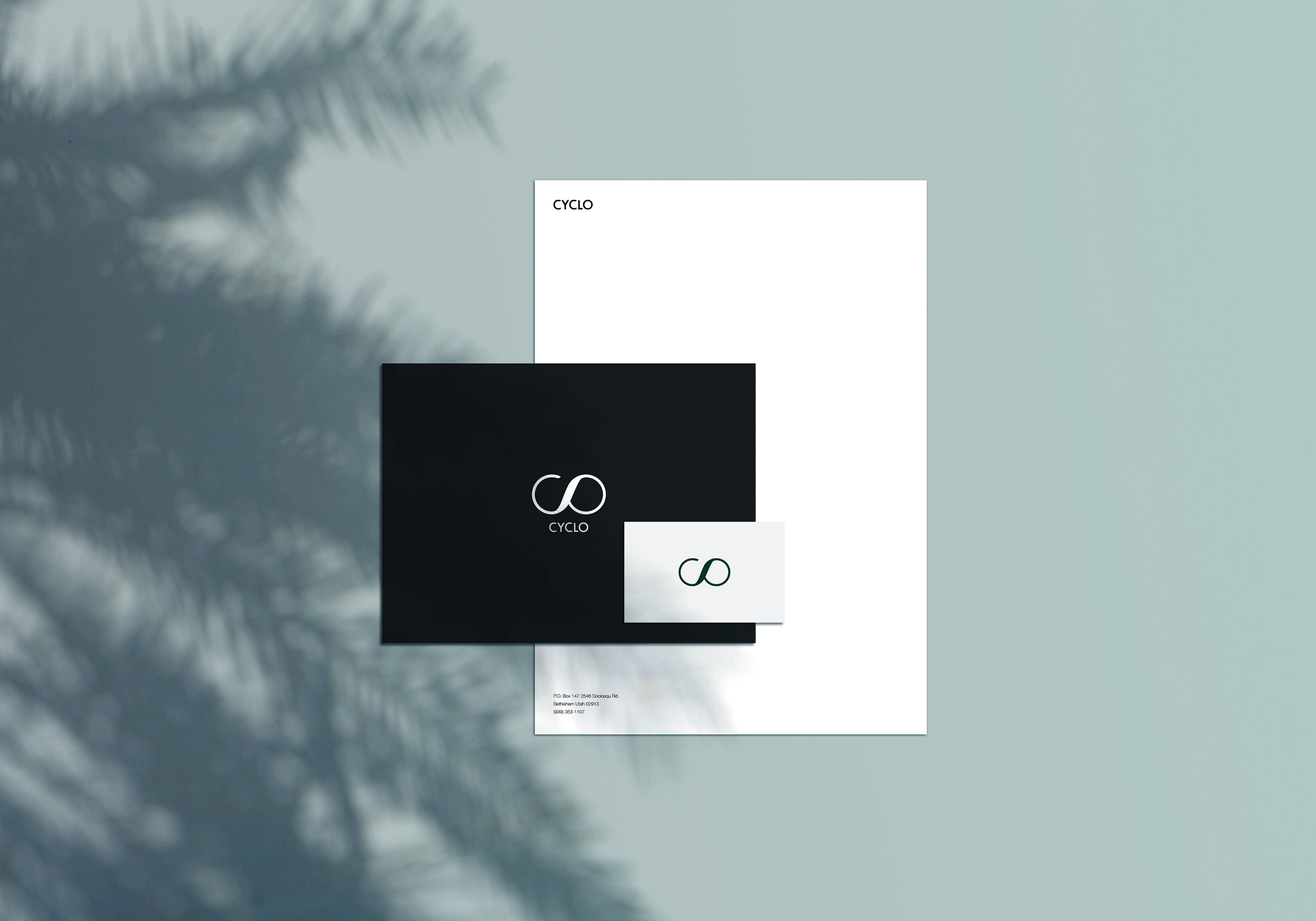
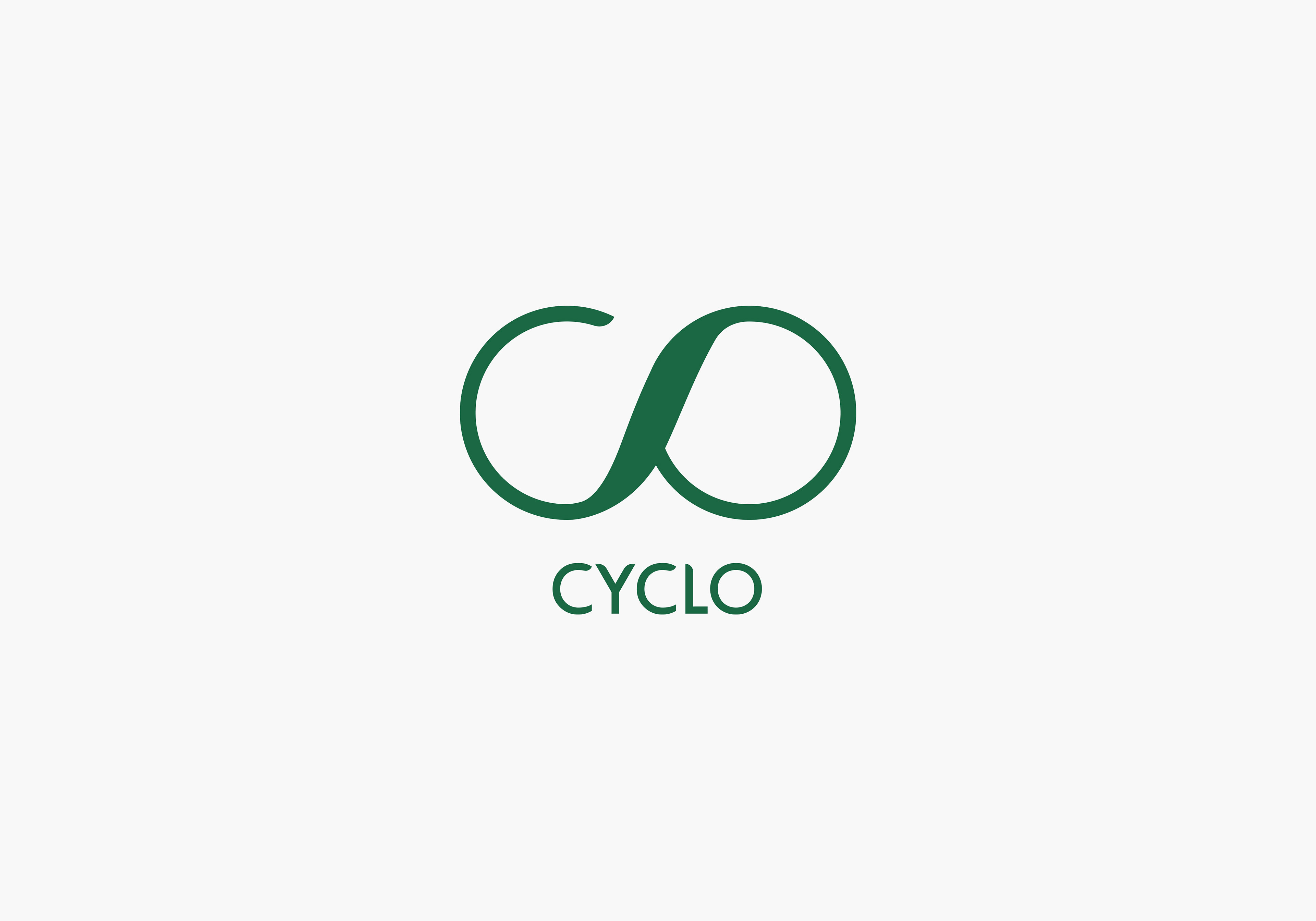
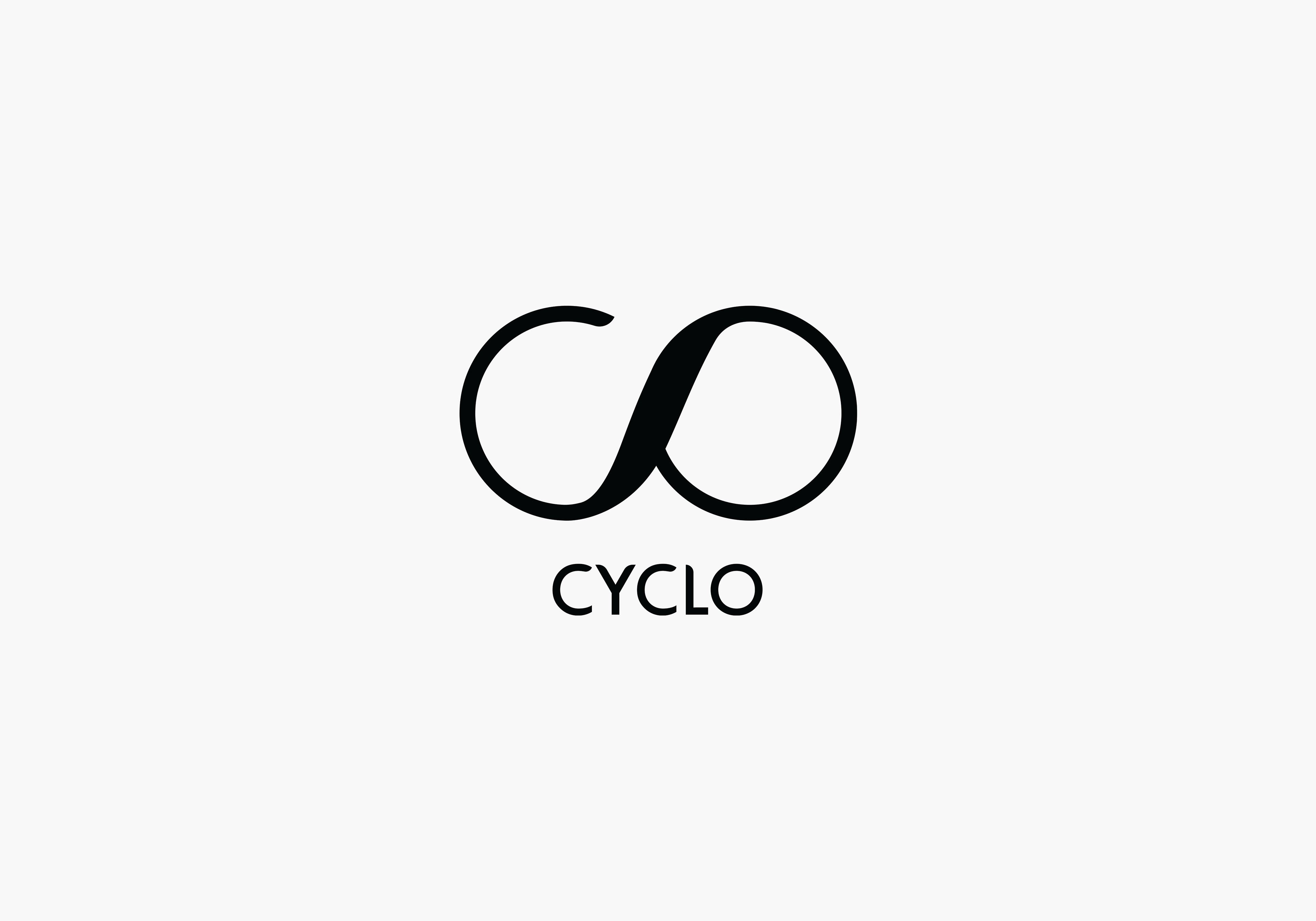
The logo is a font based logo where the letter C,L, and O from the name Cyclo, are connected in order to create a bike-like shape, and to represent the connection between city and nature. The tips of the letters are inspired by a shape of leaf which represents natural environment.
For the color palette, dark green is chosen so as to represent growth, uniqueness and prosperity since it's a color that can evoke powerful emotions and associated with stability and growth.
For the color palette, dark green is chosen so as to represent growth, uniqueness and prosperity since it's a color that can evoke powerful emotions and associated with stability and growth.


Thank you :)
Brand identity, Spring 2017
High school exam assignment
Made at Årstad videregående skole
High school exam assignment
Made at Årstad videregående skole