About the project
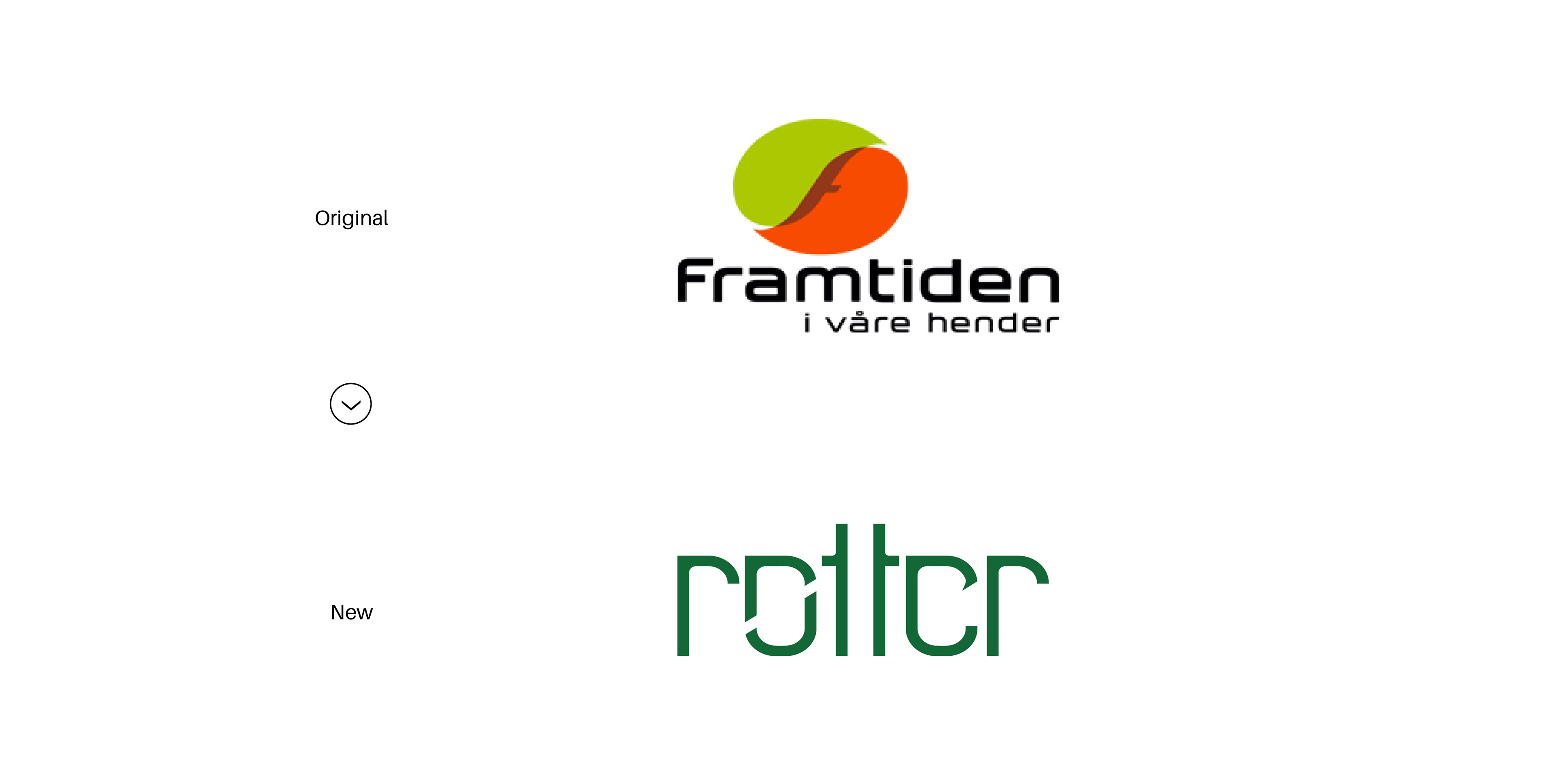
This project is a proposal for a new identity, including a new name, logotype and color palette for the organisation called "Framtiden i våre hender" (Future in our hands).
What is Framtiden i våre hender?
Framtiden i våre hender (Future in our hands) is Norway's largest environmental organization, and works for a fair distribution of the world's resources. The organization think that the sustainability of nature and the climate is more important than growing the consumption and economy of rich countries. They create support for the need for a reduced consumption of natural resources in Norway, to protect the environment and the world's poor. Create a longing in the population for a less commercialised society, and a lifestyle with a reduced focus on materialism.

Solution
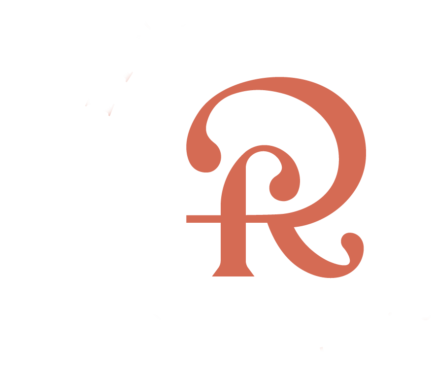
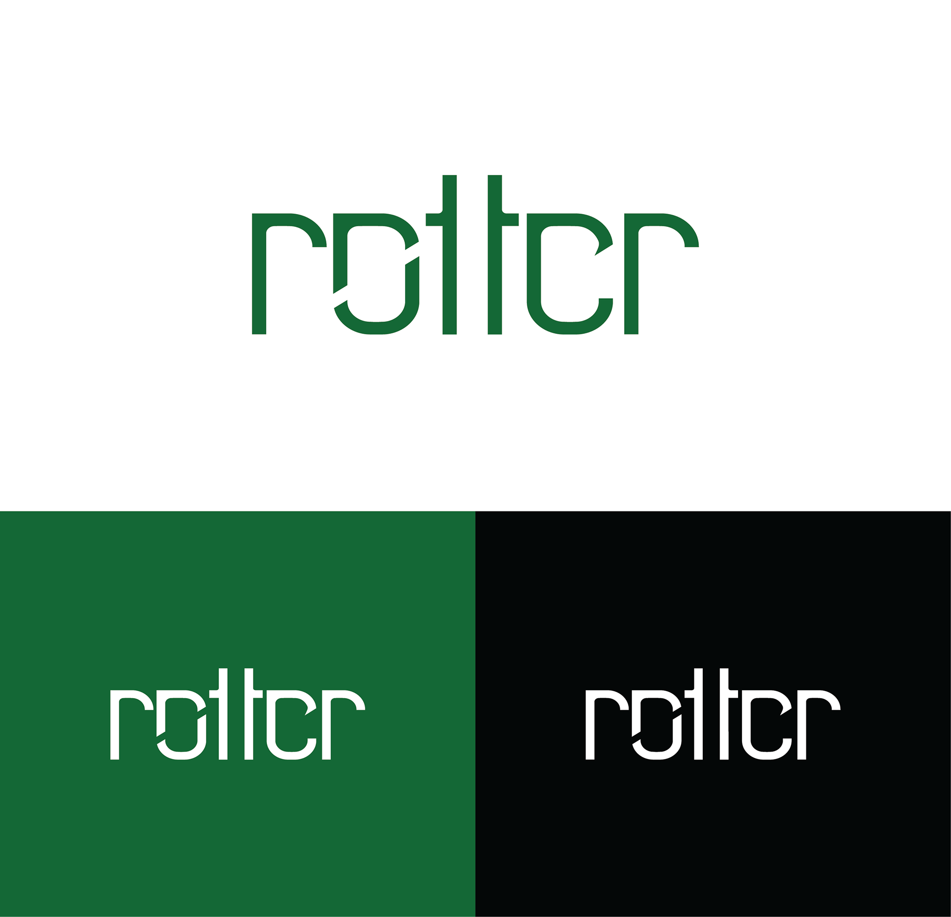
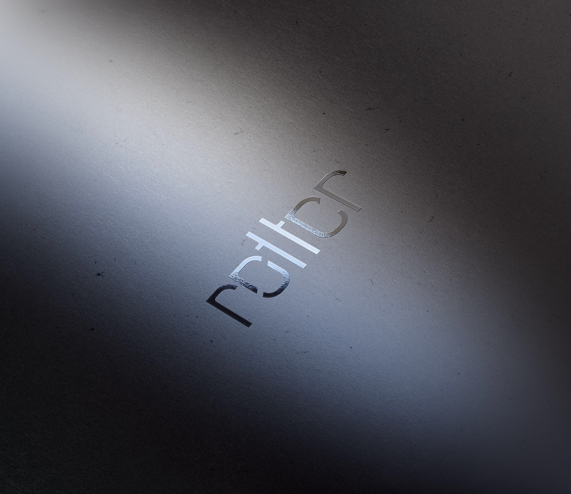
Røtter (Roots) is the name that was chosen. Roots are important for trees and trees are important for our ecosystem and our future. Since it is an organisation that strives for a fair narrative of the world’s resources and green consumption, deciduous green was used for the logo. It also gives association to nature, growth, and balance.
Thank you :)
Academic assignment, spring 2019
Advisor: Prof. Jorunn Småland
Made at Faculty of Fine Art, Music and Design, UiB
Advisor: Prof. Jorunn Småland
Made at Faculty of Fine Art, Music and Design, UiB